A fresh look for OMP 1.2 and OJS 3.0
When we redesigned the OJS 3.0 backend in time for the beta release, we had to rush out a frontend. We’ve now had a chance to revisit the reader interface, think about the wide variety of use-cases we need to support, and put together something we’re pretty happy with.
In this post I’ll give you a look at our new frontend reader interface and go into the thinking behind some of the decisions we made.
I’ll be showing you screenshots from my own test OMP installation. The OJS frontend is similar. OMP is just a bit farther along as we gear up for the OMP 1.2 release.
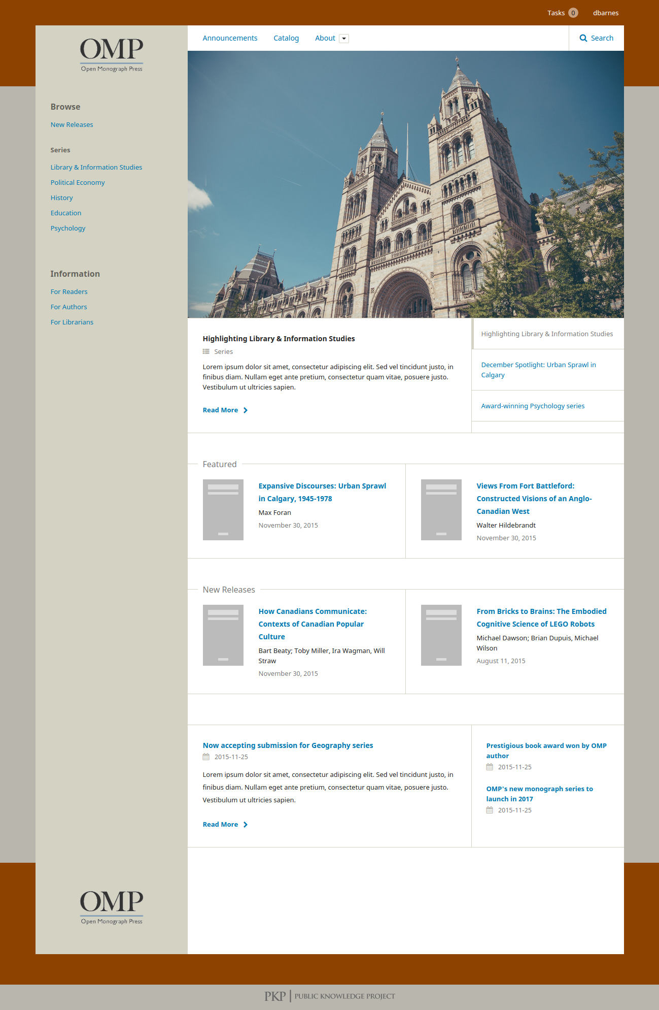
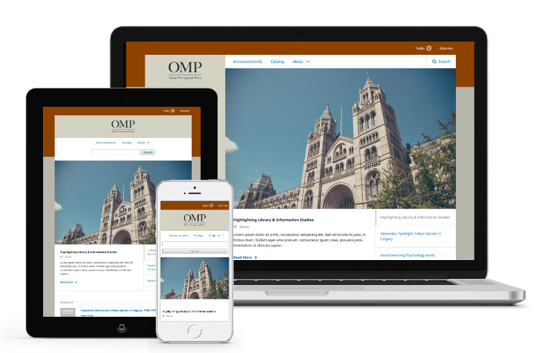
Responsive, mobile-friendly design
The first principle we had to tackle was ensuring the reader frontend was easy to use on a mobile device, touchpad or any of our small-screen cousins.
While academic publishing lags behind other publishing sectors in the relative weight and priority of its mobile users — for understandable reasons — it’s becoming more and more critical to offer browsing experiences that are comfortable across a range of devices.
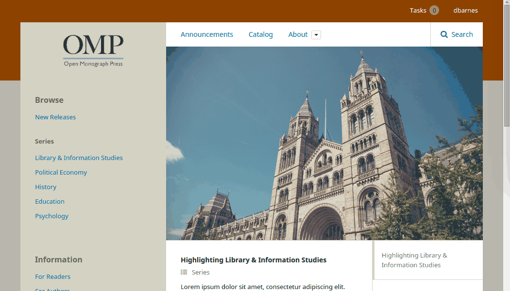
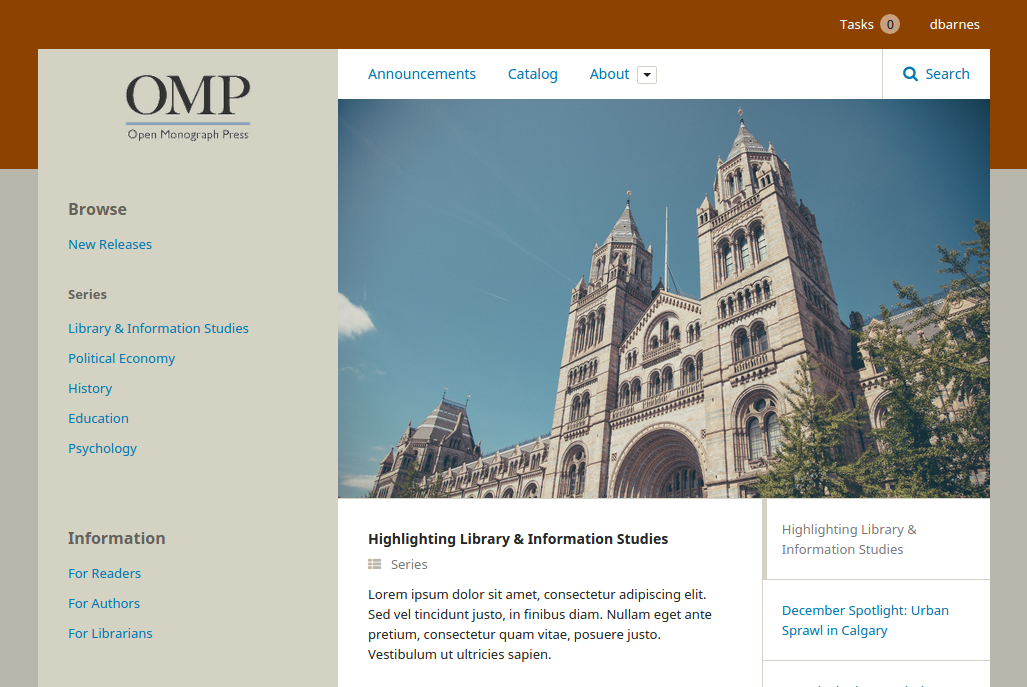
The new frontend offers appropriate, collapsed views for small devices and scales up as the visitor’s browser size increases. The full desktop view presents a familiar, traditional view with a sidebar on the left.
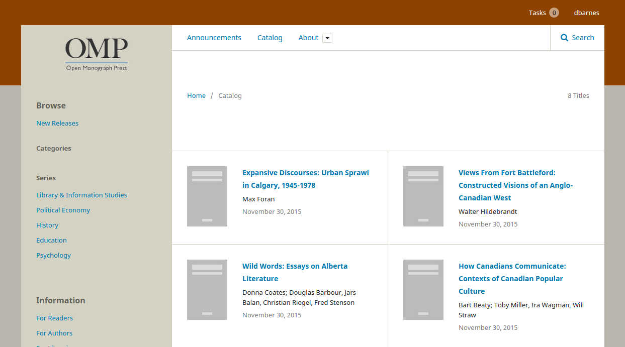
Fast, easy browsing and searching
Academic researchers and librarians often know exactly what they’re looking for when they visit a journal or press website. We wanted to make it as easy as possible to drill down and locate what they want, or to search across the catalog/journal.
Our browse block plugin will be familiar to OMP users and it will play a strong role in the new frontend as well. For OJS users, we’ll be working on simple, clear navigation patterns for journals as well. For both, we’ve included a prominent search bar to locate items quickly.
Flexible and re-usable content blocks
The biggest challenge when designing an open platform like PKP’s software suite is finding a design which can accommodate the vast diversity among our users. Some will have a lot of resources, high visual impact and a marketing team writing copy. Others will get by with a smaller team and a smaller budget.
To accommodate this diversity, we settled on a design which carefully ring-fenced the content with strong design cues. Sidebar blocks are clearly distinguished from the main content and given generous spacing. Whatever block content you toss into the sidebar, it shouldn’t disrupt the continuity of design with other blocks or with the main content.
This pattern was repeated with our catalog displays. Each book is boxed off and clearly separated. This will help retain visual cohesion for each book, whether the thumbnail is large or small, or even in cases where some titles or author text are very long and others are very short.
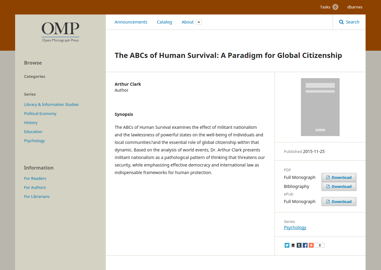
And finally, we used the same boxed pattern for the book page. Every publisher has it’s own set of data which they want to display on the book page. By providing a small side-box for each piece of data, we hope it will be easier for publishers to add their own data while maintaining visual cohesion within the design. More about customizing templates will come in a future post.
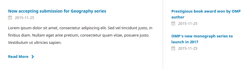
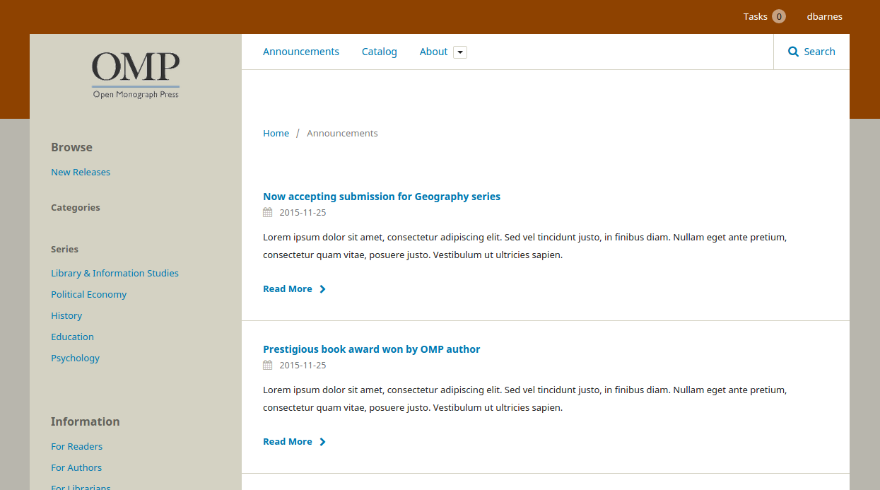
Announcements
Announcements now get a more conventional news treatment on the homepage.
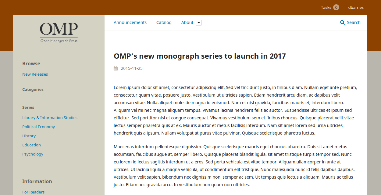
They also get their own URL so you can include a fully-detailed post for your announcement. This will help increase the announcements’ exposure for search engines as well as give you a proper link you can share to take people directly to your announcement
And finally, they get a proper archive page which lists all past announcements.
Adding custom content, templating and branding
We’ve increased our use of slots for generic content blocks. You can use these to add content to the homepage, footer and sidebar. This should give you more flexibility to add content without needing to tamper with the template files. We’ve also made it easier to change the colour scheme — though for the moment this will still require a bit of fiddling with the CSS code.
In a separate blog post aimed at developers I’ll cover the improvements we’ve made to the template structure. This will hopefully make it easier for developers to extend or modify the frontend.